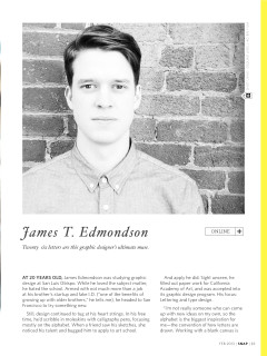
James T. Edmondson
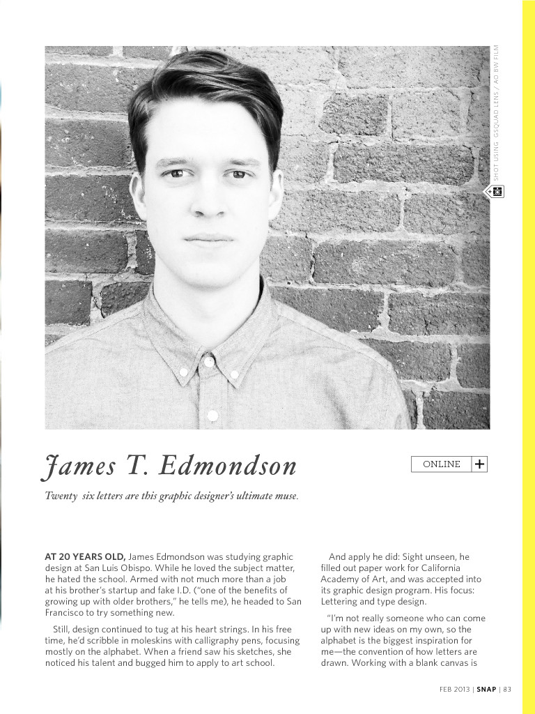
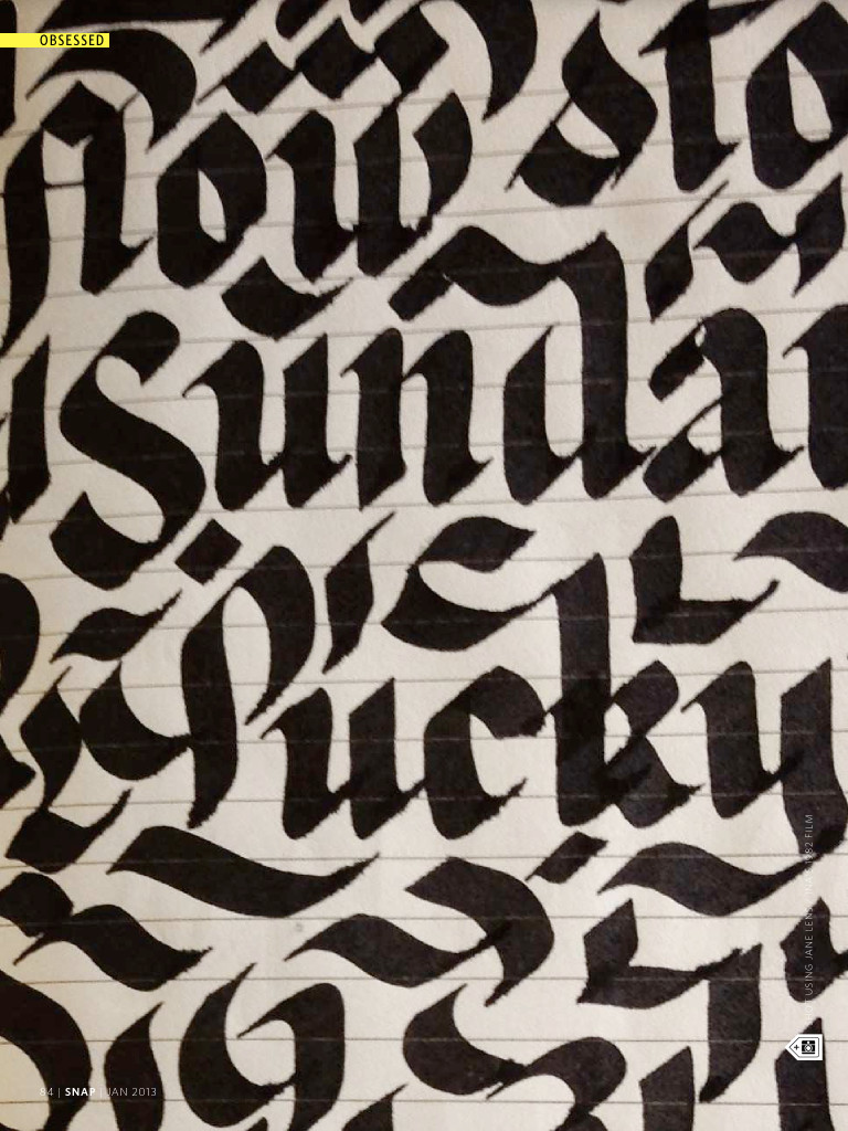
Twenty six letters are this graphic designer’s ultimate muse.
At 20 years old, James Edmondson was studying graphic design at San Luis Obispo. While he loved the subject matter, he hated the school. Armed with not much more than a job at his brother’s startup and fake I.D. (“one of the benefits of growing up with older brothers,” he tells me), he headed to San Francisco to try something new.
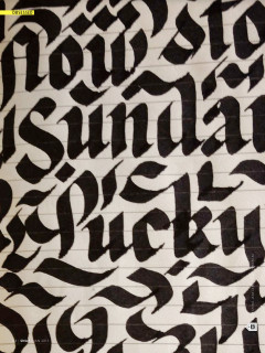
Still, design continued to tug at his heart strings. In his free time, he’d scribble in moleskins with calligraphy pens, focusing mostly on the alphabet. When a friend saw his sketches, she noticed his talent and bugged him to apply to art school.
And apply he did: Sight unseen, he filled out paper work for California Academy of Art, and was accepted into its graphic design program. His focus: Lettering and type design.
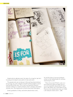
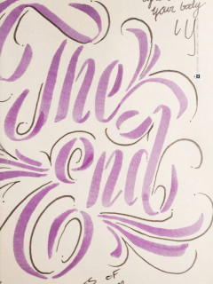
“I’m not really someone who can come up with new ideas on my own, so the alphabet is the biggest inspiration for me—the convention of how letters are drawn. Working with a blank canvas is impossible for me, because there are so many inherent rules and formulas in typography. So, [the alphabet] is the perfect skeleton. The other thing about that skeleton, it’s like there’s 500 different skeletons. If you have a lower case ‘a’, you have a roman serif lower case a, script lower case a, an italic or a black letter, it goes on and on, but these things are readable for people, which is so cool to me.”
Visit his website, and his passion is evident. There are examples of his earliest work (“I’m planning to scrap it all soon, completely start over,” he says, like a true, unsatisfied artist). What’s also clear is his love for black and white.
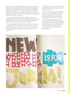
“If you get a design working in black and white, only then can you add color and see how that works. Because if it works in black and white, it’ll work any way really. So, that sort of positive and negatve balance, if you nail it, you’re in such a good place.”
Now that James is gaining attention for his work, he sees his type in a variety of unsuspecting places.
“The first time I saw my work used in a big way...it was a billboard in Las Vegas and I was super psyched. It wasn’t a super great billboard or anything, but I was excited to show my mom,” he said. “But after that, now people send me stuff every day, which I totally appreciate. The bummer is when I see the type used in something I hate. The other bummer is seeing when people stretch your work, which is like a cardinal sin of graphic design.”
Asked who he admires most, he notes it’s a long list, but he’s focusing on having his own point of view and voice. “The people who are my heroes in this and have been doing it for so long, you can’t compare yourself to those people or you’d feel horrible all the time. This is such an important thing for anyone working in a creative industry: Don’t compare yourself to anyone, ever. You’re gonna do so much more harm than good.” James graduates in May, and when asked what’s next, he said he plans to pursue graduate school in the Netherlands to continue mastering his craft.
“They only accept 15 kids a year, so I am trying not to get my hopes up so I am not completely devastated if I don’t get in. But either way, I have been in San Francisco for several years now, so I think I am ready for what’s next.”—MS